Introduction
In a significant move that echoes a commitment to national development and a forward-thinking approach, the Institute of Chartered Accountants of India (ICAI) recently unveiled a new CA logo for its members. This unveiling took place at the GLOPAC Conference, marking a pivotal moment in the history of the organization. Let’s delve into the reasons behind this transformative change and explore the various elements that make up the new CA India logo.
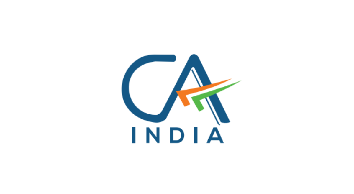
In the Global Professional Accountants Convention (GloPAC), the Institute of Chartered Accountants of India (ICAI) revealed a new logo for Chartered Accountants (CAs). The symbol represents the accounting profession’s commitment to becoming a nation-building partner.
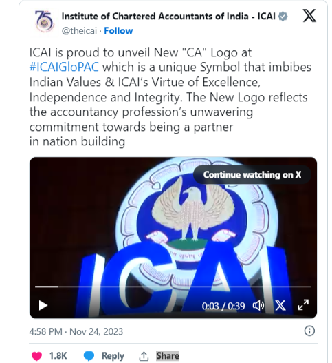
The Institute tweeted on ‘X’
History of Old CA Logo
Before we delve into the intricacies of the new CA logo, it’s essential to understand the history and significance of the old CA logo. The previous emblem, a symbol of tradition and trust, served the institute well for years. However, the dynamic nature of the accounting profession and the evolving landscape prompted ICAI to embark on a journey of rebranding.

Incorporation of Tricolor
The most striking feature of the new CA logo is the incorporation of the tricolor. The three colors of the Indian flag – saffron, white, and green – represent unity, diversity, and sovereignty. This symbolic choice reflects the institute’s deep connection to India and its dedication to serving the people of the nation. The tricolor, strategically designed to convey a sense of motion, flight, and progress, aligns with ICAI’s forward-thinking ethos.

Significance of Blue Color
Blue takes center stage in the new CA logo, drawn from the original ICAI emblem. This color holds profound cultural significance, representing divinity, immortality, bravery, and determination. As the color of the sky and ocean, blue reflects vastness and has been an integral part of India’s cultural, political, and social landscape for over 5,000 years. The choice of blue underscores the institute’s commitment to tradition, integrity, and trust.

In a Nutshell
The new CA India logo is a visual embodiment of the Institute of Chartered Accountants of India’s commitment to both tradition and innovation. The strategic incorporation of the tricolor, the deep-rooted significance of the color blue, and the overall design eloquently convey ICAI’s values and unwavering dedication to actively contribute to the development of India.
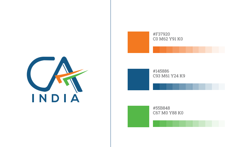
Guidelines (2023)
To ensure consistency and adaptability across all platforms, ICAI has provided comprehensive guidelines for using the new logo. The color palette, design elements, and adaptability on digital and analog platforms underline the modernity of the brand while maintaining its strong identity.

Conclusion
The decision to change the CA logo at the GLOPAC Conference marks a strategic move by ICAI to embrace change, align with contemporary design principles, and signify its commitment to India’s growth. The new CA logo stands as a symbol of the institute’s values, encapsulating tradition, integrity, and a forward-thinking approach. As members transition to using the new logo, it signifies not just a visual change but a renewed commitment to the profession and the nation.